Quick Summary
Introduction
When it comes to interpreting and consolidating enormous data sets into easy-to-comprehend visuals, executive dashboards like Power BI are the saviors. It is often cumbersome for people in executive and leadership roles to go through detailed analytics and draw conclusions. Executive dashboards like Power BI compile analytics from various sources such as customer interactions, business locations, and departments onto a unified platform. These dashboards cut through the noise, eliminate subjectivity, and help executives like CEOs, CTOs, CFOs, and HR Managers in decoding complex metrics and uncover actionable insights.
Power BI executive dashboards play a crucial role in providing a quick summary or an overview of analytics, vital for decision-making. It provides a quick snapshot of things and highlights the areas that need immediate attention. Whether you need to answer the critical questions of the investors and board members, it offers a go-to place to interpret complex data, identify patterns and outliers, and communicate the findings to stakeholders.
This comprehensive post will answer all your questions about Power BI Executive Dashboards, their uses, important metrics, types, features, and set-up steps.
What is a Power BI Executive Dashboard?
In Microsoft’s Power BI, dashboards are high-level, interactive tools that enable busy professionals like CEOs, CMOs, and strategic leaders to get a top-line view of their organization’s performance. They can monitor critical metrics like revenue growth, track KPIs, identify trends, and forecast opportunities. Known for their powerful data capabilities, these executive reporting dashboards cut short time analysis time. They integrate information from multiple sources from cloud services to spreadsheets providing a comprehensive view.
Its amazing data visualization capabilities equip leaders to grasp complex data through interactive charts, heat maps, and graphs. People in management roles can easily identify trends, assess risks, and make data-driven decisions using its AI and predictive analytics functionalities.
Research from the American Management Association indicates that employing visual language in meetings can reduce their duration by an impressive 24% due to quicker decision-making processes.
The best part is that you can customize it to align with your business goals and roles. If you want to prioritize certain KPIs and metrics, it supports you in focusing on specific data points, empowering you to fulfill your unique strategic preferences. Most importantly, if you travel a lot and want to utilize your time to get important insights at your fingertips, you can access these executive dashboards on mobile on the go.
Often referred to as canvas, the executive reporting dashboard’s single-page view contains a summary of the entire story. As a leader, you can view each aspect, such as revenue and expense breakdown, as a tile. Its real-time capabilities allow you to view changes to these pictures as the underlying data changes.
Key Components of Power BI Dashboards
Power BI Executive Dashboard features three key components:
1. Executive Summary Dashboard:
- Overview of performance,trends, and marketshare
- Visual representations of business metrics
- Top/Bottom SKUs and interactive drill-downs
2. Customer Deep-Dive Dashboard:
- Key Account analysis by product and market
- Customer comparisons across formats and divisions
3. Category Deep-Dive Dashboard:
- Revenue, price, profit, and value share analysis
- Caegory comparisons across brands, divisions, and channels
Top Metrics for Enterprise-Level Power BI Dashboards
These leadership dashboard metrics are strategically aligned KPIs tracked on Power BI Executive Dashboards. They offer insights into the organization’s performance including operations, marketing, and customer satisfaction. Some of the most common metrics used on enterprise-level Power BI solutions are:
1. Financial Metrics
These metrics enable the leaders to evaluate the financial performance and health of the business.
- Revenues are generated over different timeframes, i.e., annually, monthly, etc.
- Profit Margins assessing the financial health of the company.
- Operating Expenses in segmented views.
- Cash Flow in real time to gauge the operational stability.
- Return on Investment assessing the efficient resource utilization.
2. Operational Efficiency Metrics
These metrics measure the operational efficiency of key processes. CEOs can identify the areas of improvement and make better decisions related to resource allocation.
- Quality Metrics such as defective rate, defective quantity, etc.
- Production Performance indicators that reflect on time & in-full percentage, early and late %.
- Supply Chain Efficiency to gauge entire supply chain performance.
- Inventory Turnover to assess whether the inventory cycle from utilization to procurement is optimized.
3. Sales and Marketing Metrics
These metrics are used to assess the effectiveness of marketing initiatives and identify sales trends. CMOs and CEOs can view:
- Sales Growth Rate to show increase or decrease in sales.
- Conversion Rate to identify how well leads are converting into actual customers.
- Customer Acquisition Cost (CAC) measures marketing efficiency.
4. Customer Metrics
Customer metrics used in business intelligence tools like Power BI provide invaluable insights to improve customer satisfaction and tailor products and services.
- Customer Satisfaction Score to view the level of satisfaction through customer surveys and feedback collected.
- Customer Retntion Rates shows how long customers stick to the company.
- Net Promoter Score (NPS) to understand the likelihood the customers recommend the products and services of the company assessing their loyalty and satisfaction.
- CLV or Customer Lifetime Value informs how much revenue can be expected from a single customer account.
- Revenue Per Region provides visuals into region-wise revenues.
- Customer Churn Rate measures the number of customers that stop buying from the company.
Benefits of Power BI Executive Dashboards
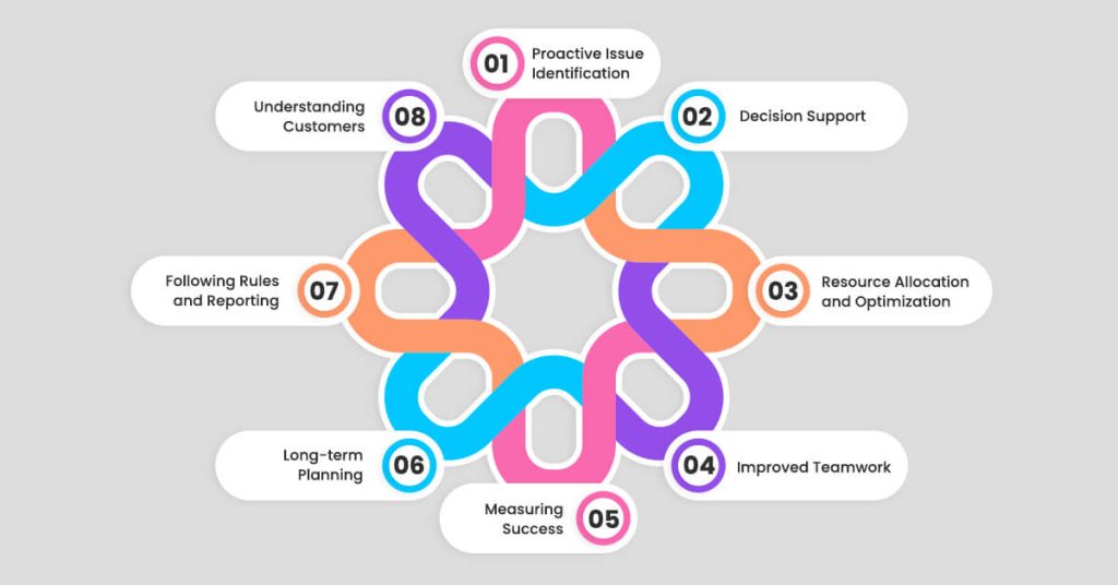
Moving on to the finale let’s explore what values these corporate performance dashboards add to your critical business role:
1. Proactive Issue Identification
Staying agile is the need of the hour for any business. AI-driven alerts in executive dashboards let you spot anomalies and possible issues right on time. You can take a proactive stance to mitigate risks promptly, minimizing operational disruptions and preserving business continuity.
2. Decision Support
When making critical decisions for business, leaders often get stuck with issues like data overload, time constraints, one-size-fits-all kinds of solutions, and data silos. By integrating data from multiple sources and providing actionable real-time insights. The real-time and customizable Power BI dashboards resolve all these issues empowering decision-making at the executive level.
3. Resource Allocation and Optimization
Dashboard analytics give executives the ability to keep an eye on how resources—such as funds, personnel, and equipment—are being used across various projects or divisions. Executives can optimize operational efficiency and minimize costs by visualizing these facts, identifying underutilized or overutilized resources, and adjusting allocations accordingly.
4. Improved Teamwork
Power BI executive dashboards boost team collaboration by offering a shared data view. This common understanding helps align goals, coordinate efforts, and keep everyone in sync, leading to better team output and efficiency.
5. Measuring Success
These dashboards let executives monitor key metrics in real time. By constantly tracking performance, leaders can spot trends, gauge progress toward targets, and make smart changes to plans and operations when needed.
6. Long-term Planning
With robust data display and analysis tools, Power BI executive dashboards aid in future planning. Leaders can use past data and predictive tools to forecast trends, spot potential chances, and create data-based strategies that fit company goals.
7. Following Rules and Reporting
Executive dashboards can simplify compliance and reporting by providing current, accurate data. This ensures the company meets legal requirements and can quickly create reports for stakeholders, cutting down on manual reporting work.
8. Understanding Customers
Power BI dashboards can combine customer data from various places, giving a full picture of customer actions and likes. This allows executives to shape strategies to meet customer needs, boost satisfaction, and grow the business.
Transform the data analysis process with interactive power BI executive dashboards!
Uses of Power BI Dashboards for Operational Insights
According to the University of Bridgeport, data analytics plays a crucial role in removing inefficiencies within operations. Now that you have a fair idea of what these dashboards are, let’s understand how you can use them to make strategic decisions and grow your business.
1. Monitoring Critical Metrics
Using these corporate performance dashboards, executives can have a centralized overview of essential KPIs such as revenues, customer acquisition, and operational expenses. Thanks to the easily accessible single view of the platform, executives can track these critical metrics in real-time at once. One can have instant visibility into the organization’s performance. It empowers the leaders to act swiftly to resolve issues and seize positive trends.
2. Identifying Trends and Patterns
The executive-level data visualization features make it easy for executives to spot patterns and trends in company data. Leaders can gain a better understanding of performance cycles and modify their plans accordingly. For instance, they can recognize seasonal variations in demand, consumer preferences, and operational irregularities.
3.Comparative Analysis
When you are aware of which areas your company is doing well and which aspects you need to focus more, you are in a better position to compete. Therefore, executive dashboards for Power BI make it possible to compare metrics side by side across different periods, product lines, and geographical locations. You can use this capability to benchmark the performance of your business, assess the efficacy of various initiatives, and pinpoint areas that require development.
4. Customer Insights and Behavior Analysis
Customer centricity is one thing that every business runs after. Power BI executive dashboards can combine and display consumer data from several sources, offering insights into customer satisfaction, purchasing patterns, and preferences. Executives can use this information to prioritize initiatives to make the products and services more customer-centric and thus increase revenues. These insights also equip businesses to retain customers, customize their strategy, and improve customer experience.
5. Forecasting and Scenario Planning
Scenario planning has become vital to thrive in the dynamic business environment. Leveraging the predictive analytics capabilities of Power BI, dashboards equip executives to forecast sales, increasing demand and inventory requirements. People working in top positions can craft different scenarios using these insights and assess the potential impact of business decisions on business outcomes, making the process more data-driven for future growth.
Types of Most-Often Used Power BI Dashboards for Executives
1. Executive Financial Performance Dashboards
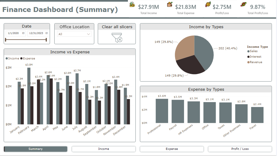
Source : Power BI Financial Dashboard
These corporate dashboards provide a snapshot of how the company is doing financially. The executives can have a quick view of assets and liabilities in real time. Other crucial ratios that supply insights about the financial health of the company are also visualized such as COGS, Net profit, and operating expenses ratio. These interactive dashboards empower the leaders to make informed decisions and communicate the actual state of the business to the key stakeholders.
2. Expense Reporting Actual vs Budget Dashboard
As the name suggests, executives can compare the actual expenses against the predetermined budgets and find loopholes and discrepancies if any. The data visualization features through pie, line, and bar charts make the insights comprehendible at a glance. They highlight the areas of unnecessary expenses allowing the leaders to monitor the spending trends.
3. Project Performance Dashboard (PMO and Capital)
Executive reporting solutions like Power BI offer extensive yet single-view project performance dashboards. They can track project progress, budget, and resource allocation, using KPIs like project completion rates, cost variance, and time-to-completion for effective project management.
4. Sales Performance Dashboard
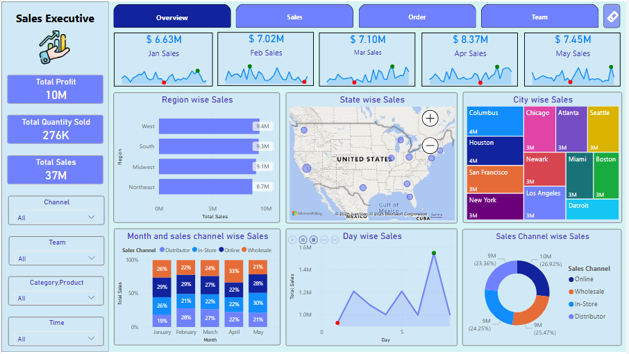
Source : Sales Dashboard
Executives can monitor sales metrics such as revenue, conversion rates, and pipeline status, to analyze trends, assess team performance, and drive revenue growth. Visualizations of customer segmentation analysis, sales forecasts, and sales trends help the stakeholders to understand product-wise sales performances.
5. Operational Performance/Management Dashboard
These interactive dashboards provide Power BI insights into operational efficiency and productivity. You can use KPIs like order fulfillment time, production output, and resource utilization to optimize processes and reduce costs. Plus, you get a snapshot view through heat maps, process flow diagrams, and gauge charts to optimize processes.
6. Marketing Performance Dashboard
Marketing is often at the risk of maverick spending. A marketing performance dashboard provides visibility into budgets, spending patterns, and ROI, helping leaders control costs, align with goals, and prevent maverick spending for optimal efficiency.
7. HR Analytics Dashboard
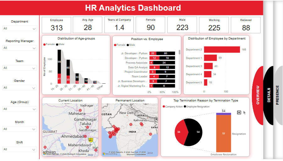
Source : HR Dashboard
Executives can learn about HR KPIs including headcount, employee happiness, diversity ratios, turnover rates, and the efficacy of talent acquisition on this dashboard. Power BI’s HR performance dashboards support strategic workforce planning by assisting leaders in monitoring workforce trends, determining hiring requirements, and gauging employee engagement levels.
Research from the American Management Association indicates that employing visual language in meetings can reduce their duration by an impressive 24% due to quicker decision-making processes.
Examples of Enterprise-Level Power BI Dashboards
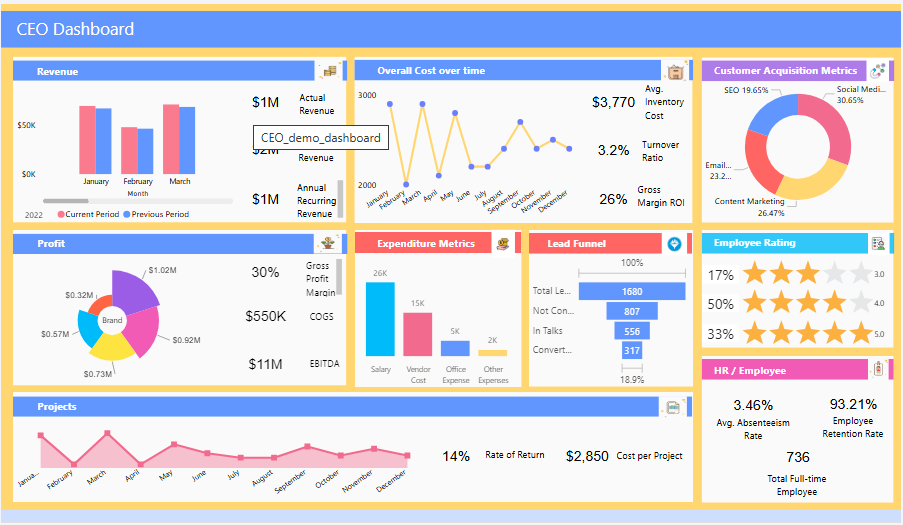
1. Business Intelligence Dashboards for CEO
Source : CEO Dashboard
As a CEO, you can have a complete picture of your organization’s different functions including customer acquisition, HR, Profit, Revenues, and Cost Drivers. X-Byte provides custom executive dashboards with the metrics and KPIs you want to prioritize for informed decision-making and communication with the key stakeholders.
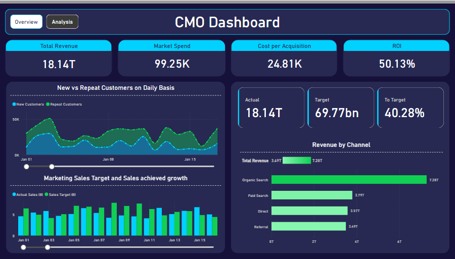
2. CMO Dashboards in Power BI
Source : CMO Dashboard
Get to know the effectiveness of your marketing efforts with these Power BI marketing dashboards for executives. Understand the contributions of different marketing channels, and gain insights into new vs repeat customers or any custom data points relevant to your decision-making.
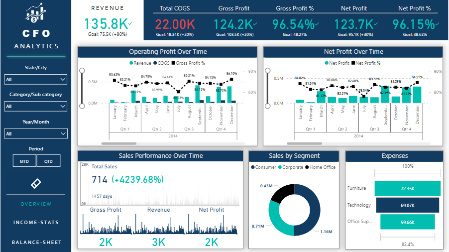
3. Executive Dashboards for CFO
Source : CFO Dashboard
You can have a single view of consolidated balance sheets, and cash flows along with the key financial ratios relevant for your business dealings. The real-time updates and interactive visualization tools are perfect to accelerate your decision-making.
Get a comprehensive view of your business on our customized executive dashboards
Must-Have Features of Executive Summary Dashboards
What features should you look for in executive-level dashboards to make the most of it? Let’s explore in this section:
- Interactive Visualization Tools: Interactive dashboards for business leaders must go beyond gauges and charts. There should be other options as well like pivots, speedometers, dot plots, line charts, and interactive graphs.
- Real-time Data Updates: Power BI’s capabilities of real-time executive dashboards are what makes it lucrative. Live data and updates will enhance your decision-making and make it more effective.
- Single-Page View: A single view of executive dashboard software provides information at a glance. You can get all the insights at your fingertips on your way to meeting the stakeholders.
- Drill-Down Features: With drill-down features, you will get in-depth details of specific data points to answer more whys and whats.
- Collaborative Features: Make sure that custom dashboards for executives you invest in have collaborative features. Power BI lets you share dashboards, datasets, and reports with your cross-functional teams.
- Mobile-friendliness: Make sure that your real-time dashboards also work well on your mobiles adding to your convenience.
- Exclusive Data Integration: The best feature of Power BI dashboards is that you can access data dispersed across a wide range of platforms. It pulls information from multiple sources from spreadsheets to APIs offering you comprehensive data for analysis and reporting.
Easy Steps to Create Executive-Level Dashboard in Power BI
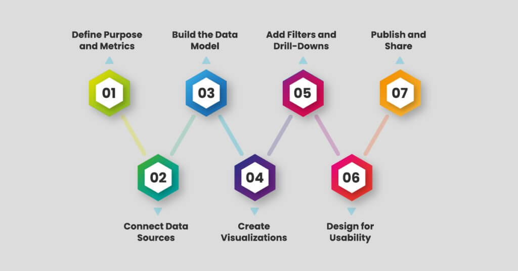
Selecting the right design tool is the first stage in creating an executive dashboard. At X-byte, we’re dedicated to Power BI, a suite of business intelligence tools that offer endless possibilities for building reports and dashboards.
Step 1: Define Purpose and Metrics
Start by identifying the dashboard’s purpose and essential metrics (KPIs). Align these with executive needs, such as sales targets or operational efficiency indicators.
Step 2: Connect Data Sources
Import data from various systems (e.g., CRM, ERP, spreadsheets). Use Power BI’s connectors to ensure seamless integration, providing a unified view of all relevant information.
Step 3: Build the Data Model
Organize and relate your imported data, ensuring accuracy and consistency. This structure will enable accurate insights and prevent data discrepancies.
Step 4: Create Visualizations
Use Power BI’s chart and visualization tools to represent data meaningfully. Select visuals like bar charts, KPIs, or line graphs that communicate insights effectively.
Step 5: Add Filters and Drill-Downs
Incorporate interactive filters and drill-down options to allow executives to explore data by period, region, or department, customizing insights as needed.
Step 6: Design for Usability
Arrange visuals in a clear, user-friendly layout. Prioritize high-level metrics and make important insights easily accessible for quick executive review.
Step 7: Publish and Share
Publish the dashboard to Power BI Service, setting access permissions to secure data while ensuring executives have real-time, mobile-friendly access to insights.
Final Word
In the age of digital revolution, the importance of these data visualization tools cannot be undermined. Their powerful intuitive interfaces turn your data into coherent immersive and interactive insights. You can customize them to your unique. KPIs, integrate multiple data sources, and get information with its unique Q&A function. Your strategic business roles, such as CEO, CFO, or CMO, serve as a cornerstone to your informed decision-making in real time.
X-Byte Analytics’ Power BI executive dashboards can be your helpmate in monitoring critical metrics, identifying trends, and making data-driven decisions.
Frequently Asked Questions
What are the main components of the Power BI Executive Dashboard?
When getting Power BI Dashboard, you can access Power BI Service, Gateway, Power BI Mobile Apps, and Power BI Desktop.
What are the different data sources from which Power BI can import data?
You can connect to more than 180 data sources and types in Power BI including various file formats(PDF, JSON, XML, etc.), on-premise and cloud databases, Azure, SaaS platforms (Google Analytics, Salesforce, etc.), and Power platforms (Power BI Dataset, Dataflow, etc.)
Is there any specific type of report I can create in Power BI?
You can create multiple types of data reports like tabular, matrix, and KPI. Moreover, you can also generate reports with drill-down, drill-up, and drill-through capabilities.
What are the key benefits I get using the executive summary dashboards of Power BI?
You can access integrated data from multiple sources (internal and external like Social media). Interactive visualization and reporting, business intelligence, and collaboration are some.
What are the best practices for creating a Power BI executive dashboard?
Define goals first and focus on KPIs that matter the most. Avoid cluttering, prioritize the metrics, and incorporate user-friendly features. Continuous monitoring is also important to optimize the dashboard for optimal performance. Lastly, review and update regularly.
